[Taking a short break from the ongoing Touchpoint Messaging 2.0 series this week. Messagepoint 4.0 (the product) just shipped, and it’s definitely relevant to meeting requirements in a 2.0 world. Sorry for springing version numbers on you like this!]
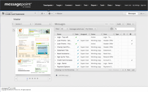
You know you’ve successfully transformed and simplified the user experience, when you can explain what you do and how you do it by simply pointing a single picture – and without a product demo. With our freshly-minted Messagepoint 4.0 release, we think we’ve achieved that and we’re pretty excited.
Great applications are more than just a pretty user interface, of course. Unpacking a customer problem and building the right solution takes time, close customer interactions, many iterations or versions, and a little trial and error. And no doubt, our product Messagepoint is a great platform for creating and managing your touchpoint messaging, and our customers and customer development partners can attest to that.
However, at a certain point in any software application’s life, rethinking and updating the user experience becomes an important juncture to support future success. It doesn’t mean the past was bad; it just means that the future will be even better. In many ways, revamping the user experience can reveal and describe what you do and what value you bring in totally new, unexpected ways, to more users and customers, which is what it’s all about.
A picture is truly worth a thousand words, and when that picture happens to be a screenshot of your core user experience, it holds the promise of making an inherently complex task — such as managing touchpoint messaging — simple.


Translation of member materials is an onerous burden for Medicare Advantage Organizations (MAOs). The Centers for Medicare &…
Read the Article
Document management teams have been dealing with the same change management issues for close to two decades. Changes…
Read the Article